Flipchart Objects – CardLists
Hint: use CardLists as templates for vertical lists where each entry has a specific series of attributes. Simplify the layout of complex to-do lists or processes with this easy-to-follow format.
Prerequisites
Section titled “Prerequisites”A flipchart-based activity started
How to use a CardList
Section titled “How to use a CardList”To use CardLists, click on the respective icon in the toolbar on the left of the screen. A second panel will emerge to the right.
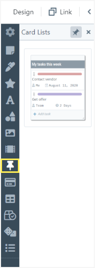
To add a CardList to the flipchart click on it in the second panel or use Drag & Drop to place it in a specific part of the flipchart.
You can set a name for the CardList by clicking and typing it in the top field.
To add a card to the list click on “+Add card” at the bottom of the object. A window will pop in the centre of the screen containing the card’s attributes.
In this window, you can write the task’s name and set a background colour to differentiate it from other tasks in the list or add a special meaning to it.
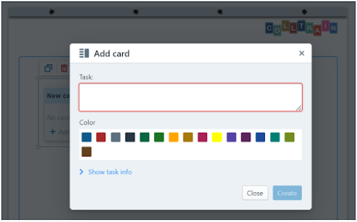
To edit the rest of the card’s details, click on „Show task info“. The window will expand and display the following options:
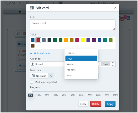
Assign the task to a person, set the duration, start date and due date
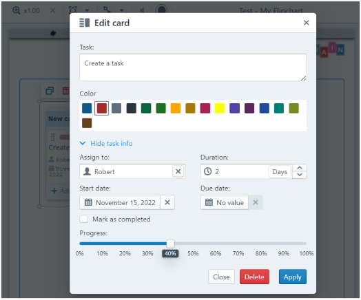
You can mark the task as completed or the progress in %, then click on “Apply”. You can add as many cards as you need by following these steps.
How to edit a CardList
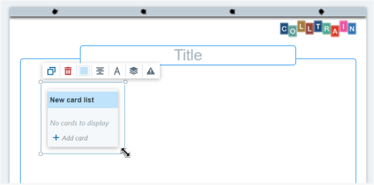
Section titled “How to edit a CardList”On top of the CardList, there is a toolbar from where you can edit the object.
You can do the following: duplicate or delete the element.
The next settings apply to the CardList’s name only.
Change the background colour
Section titled “Change the background colour”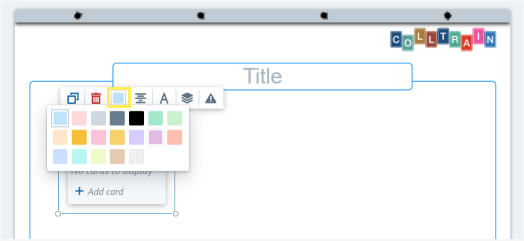
Text alignment
Section titled “Text alignment”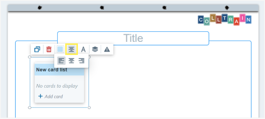
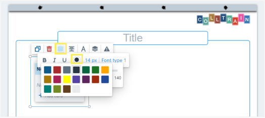
Text options
Section titled “Text options”Choose between Bold, Italic, or Underline and set a text colour from the chart
Font size
Section titled “Font size”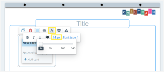
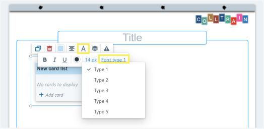
Font type
Section titled “Font type”Choose a font out of the available 5 options
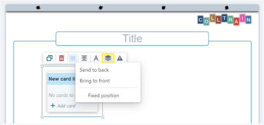
Layers
Section titled “Layers”Set the position of the CardList in regard to other objects on the flipchart – front/back/fixed position
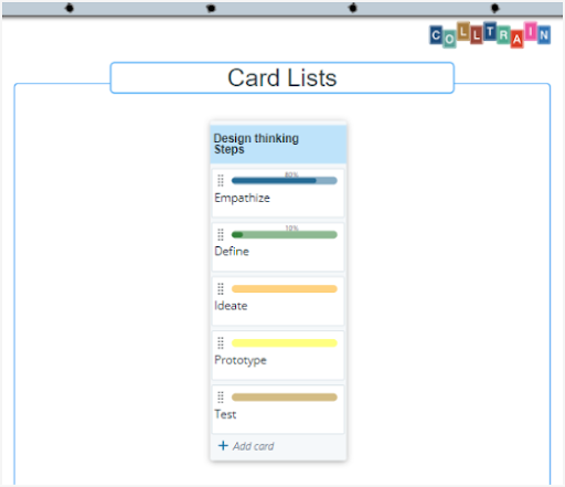
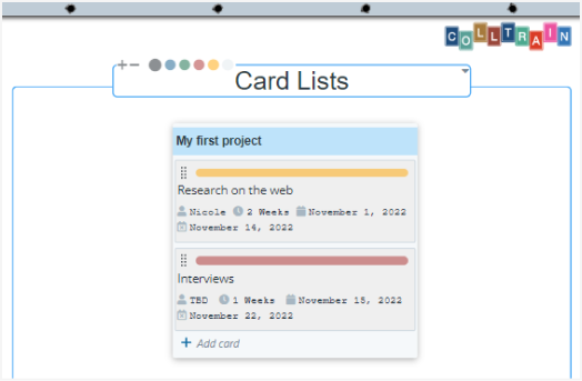
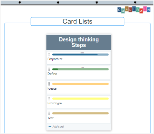
Here’s an example of an edited CardList:
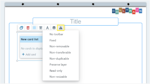
Element behaviours
Section titled “Element behaviours”These are visible when Design mode is enabled (see the „Object behaviour“ page)
You can also resize the card list by pulling from any corner.
Task for you
Section titled “Task for you”Start an activity and set up a to-do list using the CardList object.